We’ve learned a lot from our coffee clients over the past few years! With a team as coffee obsessed as ours is, it was inevitable that we would begin cultivating relationships and friendships in the coffee community, leading to all kinds of creative engagements.
“What? You need some more product shots? Espresso? From the Slayer? No problem.”
We have managed to stay caffeinated and inspired through the largesse of our clients and friends. Along the way, we’ve picked up a fairly extensive body of Knowledge about what works and what doesn’t when it comes to creating and curating coffee brands.
We Drink Coffee with our Eyes First
We are a visual culture. A whopping 20% of our brain is dedicated purely to vision! And that part of our brain goes on to ultimately interact with at least half of our brain, triggering a tidal wave of sensations, emotions, thoughts and desires.
Coffee is perfectly positioned to take advantage of this hardwire biology. Even images alone — such as photos on your website or Instagram — can instantly transport the viewer to a happier, more contented mental state. An MIT study published last year suggests that we can understand the meaning of an image in only 13ms!
Combine stunning visuals, such as espresso shots being pulled, with aroma and the sounds of a cafe and you have a powerful positive reinforcement.

So how does this apply to your coffee branding? Remember that your brand is not a logo, or a website, or your name. Your brand is every touchpoint with your customers. So curate every image to evoke an emotion in the viewer. Consider color, lighting, the expressions on faces, the emotional impact of a great looking cup of coffee being virtually handed to you over Instagram. Also pay attention to the drama your baristas enact every day as they present this nectar to the customer. They should reverence the cup, present it with a beautiful visual, and smile as they do so. Sound trite? It isn’t! It is the very first interaction your customer has with your coffee brand. Make it count.
Good Branding Can’t Overcome Crappy Coffee
Above all else, we know this one, right? One of our coffee clients experienced a drop in customer satisfaction shortly after opening. A little research yielded inferior beans that had been mixed into their custom blend without their knowledge. Fortunately, a skilled palate and visual inspection revealed the problem, the coffee was restored back to its former flavor profile and all was well.
The lesson we learned from this experience is that crappy coffee can’t be overcome by a pretty package. In fact, great packaging filled with substandard coffee creates a cognitive dissonance in the customer!
To illustrate this brand promise failure, we only need to look at the “great Starbucks shutdown of 2008”, when returning CEO Howard Schultz closed every store system-wide in order to retrain its baristas and revamp its falling sales. Among other brand failures was a simple one: they had switched to a bland but more stable espresso bean and automatic espresso machines in order to increase efficiency. But the customers were unimpressed. They wanted the drama of hand-pulled shots, and they wanted the aroma of good coffee.
Check your quality frequently, and don’t be afraid to make bold moves to correct any brand promise failures.
Coffee Culture is Stronger than Just Having the Right Visuals
We’ve heard a variation of this statement many times from future clients during their intake interviews: “We want to create a great coffee culture.” Sounds great, except it can’t be done.
You can’t create a coffee culture. It already exists.
You can only join in. And joining in requires more than having the requisite wood, marble, equipment or brands.
You need to have someone on your team who “speaks fluent coffee.” Seriously. In every city across the world there is a network of highly caffeinated, buzzing, and intensely loyal coffee people. Some of them roast, some of them roast and own shops, some of them sell other people’s coffee in their shops. And others travel from spot to spot connecting the coffee community and bearing tales back and forth. They compare notes on brewing methods, origins, and equipment. And they tell tales!
So make your tale one they want to tell!
Spend some time with the coffee people who will wander into your shop (at least once!). Swap some stories. Talk shop. Share your knowledge. Nothing stops coffee culture quicker than thinking your trade secrets are…well, secret. The coffee community thrives when everyone works together in a city or region, so they really aren’t as competitive as other industries. Enjoy this, and jump in with two feet! Share how you got into the industry, or whose coffees you particularly enjoy. Attend any meet-ups in the area, and be willing to pass the time of day with enthusiasts who wander into the shop.
Finally, make sure you run all your social posts and signage by your resident “coffee speak” team member. You can damage or enhance your brand simply by which words you choose.

And oh yes — those visuals in your store? They really do count for quite a bit. So provide picture-worthy vignettes, choose your finishes to match your brand story, and train your baristas to not mind pictures day in and day out!
Simple and Clean Eliminates Confusion
Another lesson our clients have often learned the hard way is this: simple and clean eliminates confusion. This applies to menu boards, printed matter, signage, and even what the customers can see from their perspective on the other side of the counter.
As you design your environmentals, keep the typefaces readable and uncluttered in order to expedite the process for you customers. Your customers should be able to tell at a glance what their options are! If you need to, provide a printed menu with more detailed descriptions, but keep your signage clear and simple. Just ask Chipotle how well it works!
Print materials really represent your brand story far more than you can imagine. Choose typefaces — again– which are readable and are in the same genre as your menu boards and other environmentals. But keep in mind the story you are trying to tell. Typefaces can be friendly and approachable, cool and sleek, classic or avant garde. Choose the ones which advance your narrative.
Design for simplicity. You have your customer’s attention for only a fraction of a moment — tell one story and tell it well.
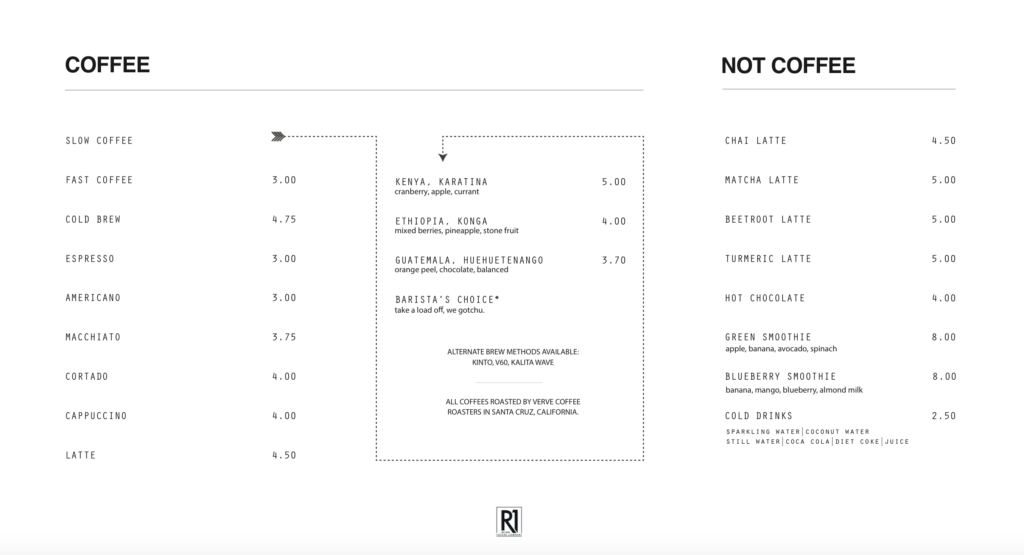
This is a menu we created for a client recently. It was clean, directed your eyes where to look and gave you three simple categories to choose from. These characteristics all matched the incredibly designed feel of the space and contributed to the overall story of the brand. The same menu was used online, and the brand’s brew guides also followed the same aesthetic. They all told the story of elegant simplicity.

Instagram is a Virtual Walk-thru of your Brand
Finally, a word about your social media accounts. In many cases, your Facebook page and — more importantly for coffee brands — your Instagram feed will be the first touchpoint you have with your future customers. It serves as the digital front door to your shop, and it needs to live and breathe the same story you tell in the physical brick and mortar location.
All well and good, but what does this mean in execution?
Take a look at your environmental clues. Is your space filled with brick and beam, wood and cement? Then your Instagram feed needs to be as well. You will want to take pictures which showcase the industrial side of your space. (And you did make sure to design a particularly Instagram-worthy photo spot, right? Whether inside or on an outside wall, this is a must. Your customers want to demonstrate they are part of your tribe: make it easy for them to do so.) If your space is airy, filled with marble and washed wood, keep that feeling in your feed. Curate ruthlessly!
What are your brand colors? Each photo should feature a touch of the brand coloring. This can be represented by people’s clothing, mugs and plates, environmentals in the shop, or even peeks at printed materials and menu boards. Just doing this one thing alone will keep your feed consistent and tell your brand story.
Who is taking your pictures? It is tempting to assign this job to everyone (“Take good shots, people!”). If you have more than one person, clarify the tone and feel you require for the feed and have one team member responsible for photo editing and posting with the right hashtags etc. Consider having professional product photography and a social media package in order to have a stockpile of images worthy of your feed. Several of our clients have found that having a stash of 30 or more photos ready to go lightens the pressure on day-to-day shooting. Then the team members can really set up some good shots to supplement the stash.

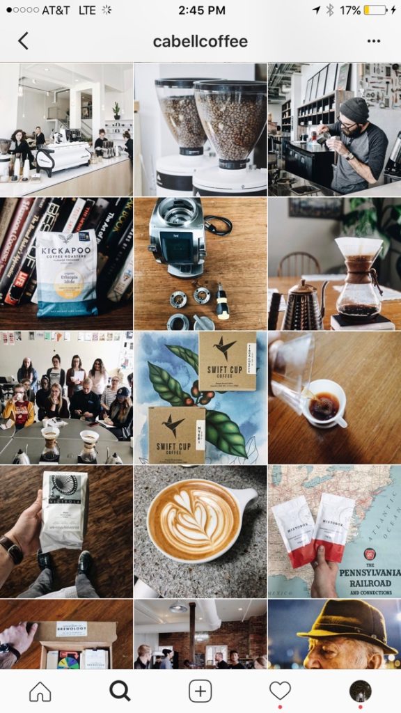
We love this image from Cabell Tice of his fabulously curated Instagram feed. Notice how each picture reinforces brand and adds personality. (h/t @cabellcoffee)
And finally, user generated content (UGC) really is a big deal. Especially among coffee people. When you find a great photo that has been posted about your space, repost it with credit and a thank you! If its feel doesn’t completely match a tightly curated feed, let it stay for a few days and then quietly remove it. It’s all about being part of the community.
